Back to: Kianda Foundation Course
Controls (also called fields) allow you to add specific elements to your forms and processes – for example, a button, text box, table or panel. If you click into a process and select a form, you will see the Controls options in the left-hand pane. If the Controls menu is collapsed, click on it to expand it to show the three categories of Controls (Input, Layout and Actions).
Controls as seen in Kianda Designer
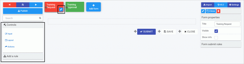
Note: By default, three buttons are automatically added to each new form created – Submit, Save and Close – as shown in the sample form canvas here.
- To remove a field, click on the field itself, then click on the Bin/Trash button
 and then click on OK to confirm removal.
 - To move a field, click on the Drag handle button
 .
. - To start adding controls to a form, select the form you want to work on so the Edit form button (Pen icon
 ) appears. Then click on a Controls category and control type from the left-hand pane. For example, you could click on the category Input and then choose Text box as shown in the video above.
 - There are properties that you can use to tailor the field/control to make it work the way you want. The next lesson will run through field properties.